COVID-19 Classroom Analysis
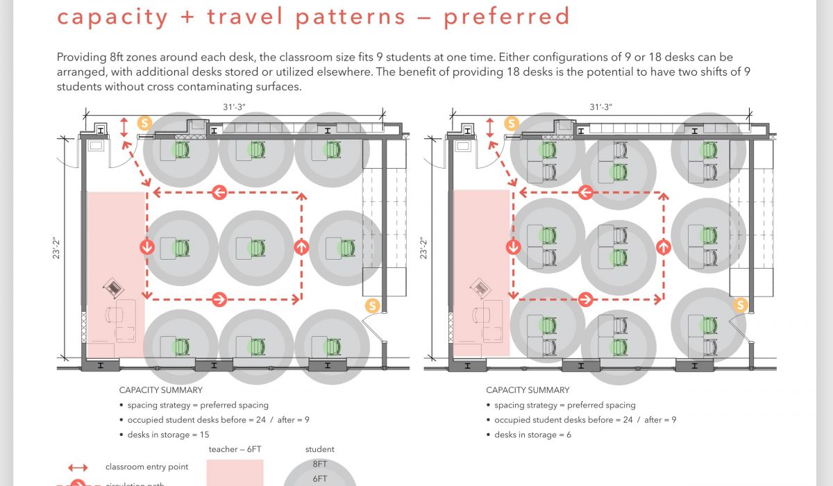
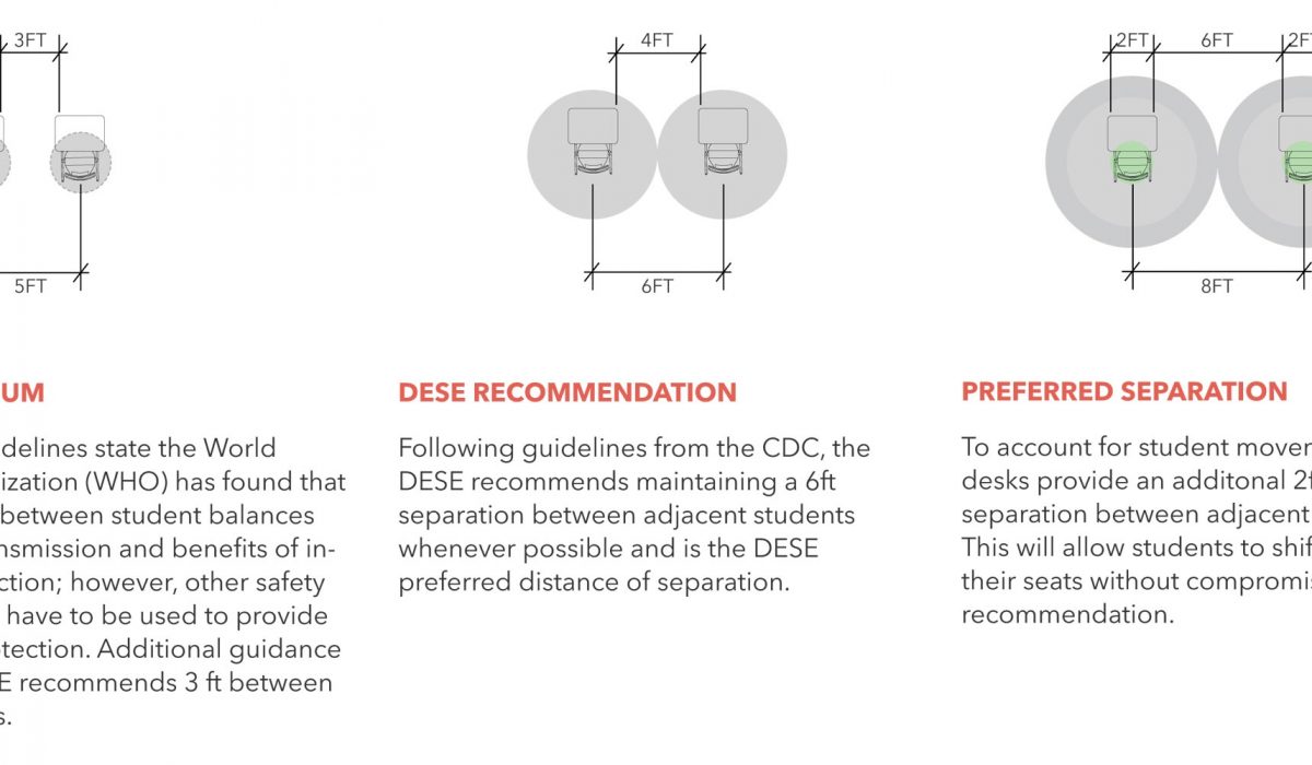
The last few months of the 2019-2020 school year was fraught with reactionary decisions due to the COVOD-19 pandemic, forcing many state officials to make choices quickly and decisively without having the proper time to plan and develop appropriate systems...
Read More ›
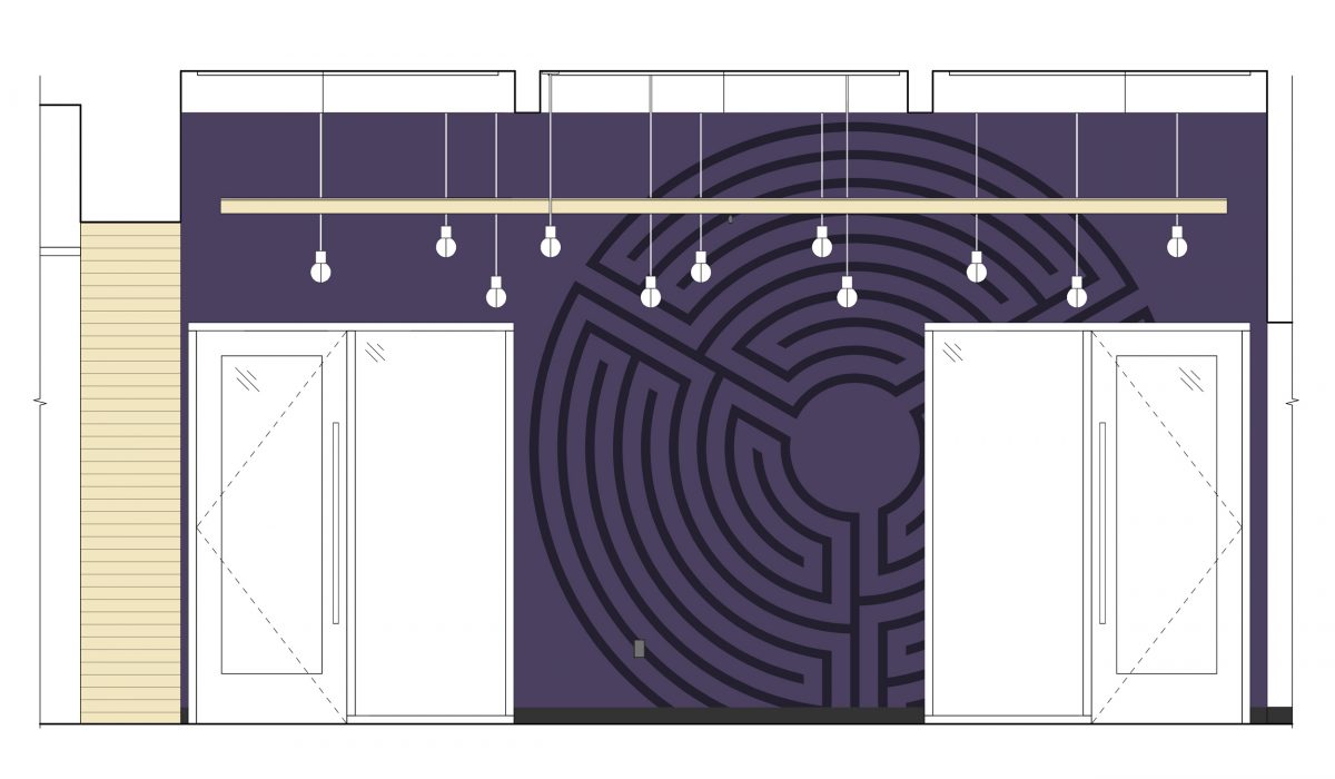
Meditate
The path of a labyrinth is rhythmic. It is not about a goal but the journey, taking one to the center and then back out to the start. Through this procession and the rhythm of twists and turns, that some see as a metaphor for life’s journey, the walker can reach a level of clarity allowing...
Read More ›
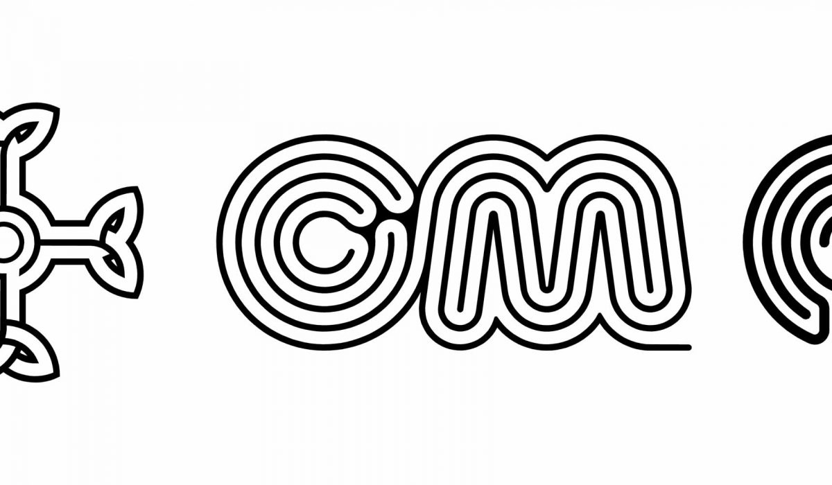
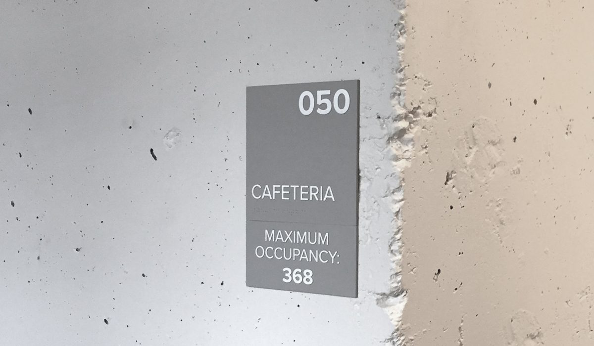
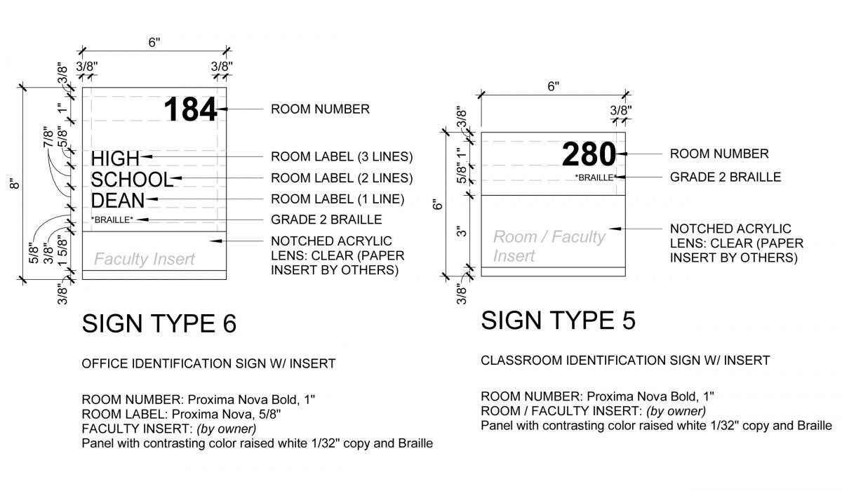
Educate and Motivate
As part of the construction administration efforts for Boston Collegiate Charter School a signage and wayfinding system was developed for the entire building to label both old and new spaces. The typography for the signs responded to the school’s...
Read More ›
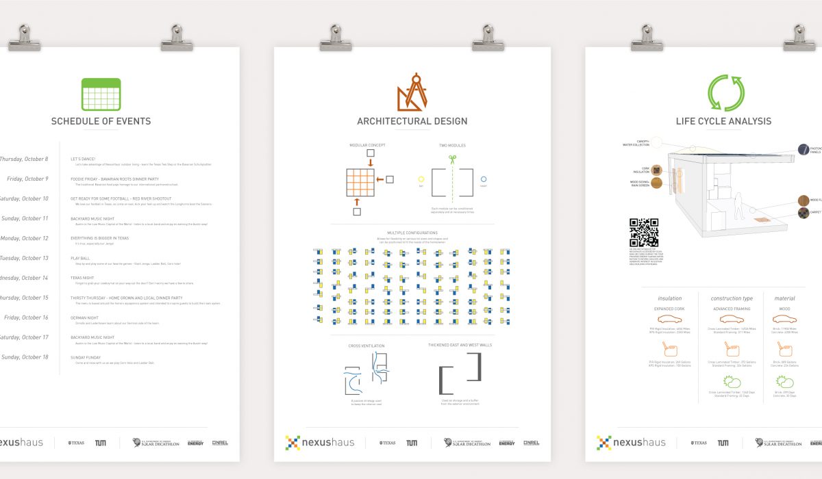
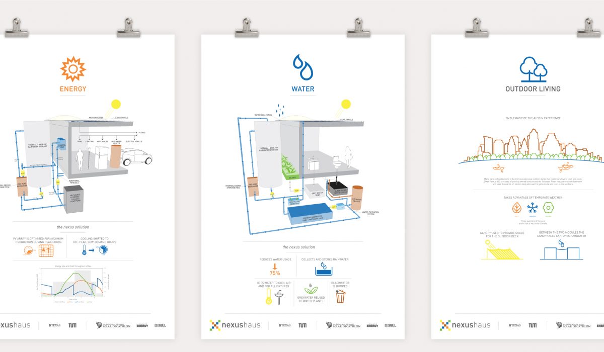
NexusHaus Branding
The University of Texas at Austin (UT Austin) and The Technical University of Munich (TUM) U.S. Solar Decathlon 2015 house is called NexusHaus because it combines the efforts of UT Austin and TUM students in an affordable, modular residential green building design that demonstrates transformative technologies in Zero Net Energy, Zero Net Water capable and is carbon neutral in its use of sustainable building materials. As part of the Solar Decathlon competition one of the ten categories was communications. The technical aspects of the home, as well as a team’s experiences, needed to be communicated to a wide audience through websites and the exhibition of homes at the final competition. Therefore a clear and coherent identity system had to be put in place to effectively exhibit and communicate the NexusHaus concept. The design was developed to mimic the initial house design with lots of white space and sporadic pops of color.
Read More ›
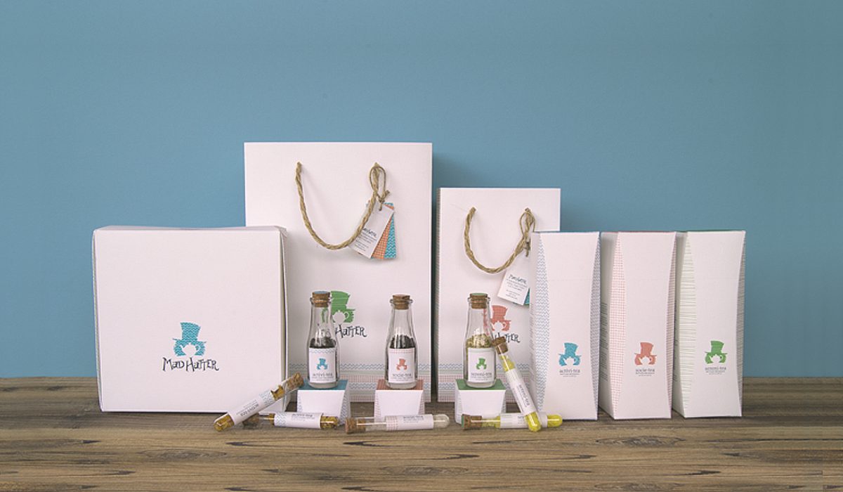
Mad Hatter Tea
Mad Hatter provides a variety of robust teas to its clientele drawing from the unique personality of the character it is named for in Alice in Wonderland. The design approach incorporated a subtle sense of eccentricity and oddity...
Read More ›
Destruction Series
Drawing inspiration from the song It’s Time by Imagine Dragons an illustration concept was devised and refined for a poster. The concept derived from lyrics mentioning a city that “never sleeps at night” and a man who will never change. The illustration was then altered to fit on a compact disc and the accomanying...
Read More ›
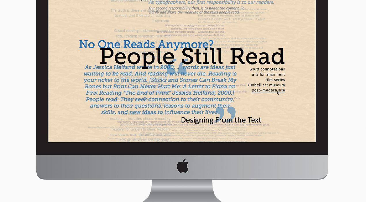
Post Modern Web Page
The web page was designed with the Post Modern Movement in mind. The layout of the content was created by drawing feeling and inspiration from its meaning. The order and rigidity of...
Read More ›
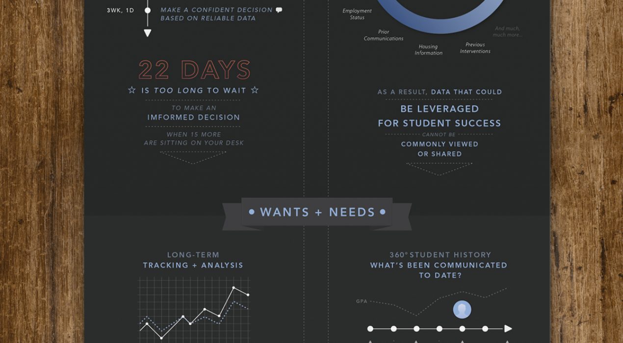
Zogotech Infographic
While interning, I worked within a group to devise two cohesive illustrations that would reside in an infographic displaying a product. I also helped my project supervisor devise...
Read More ›
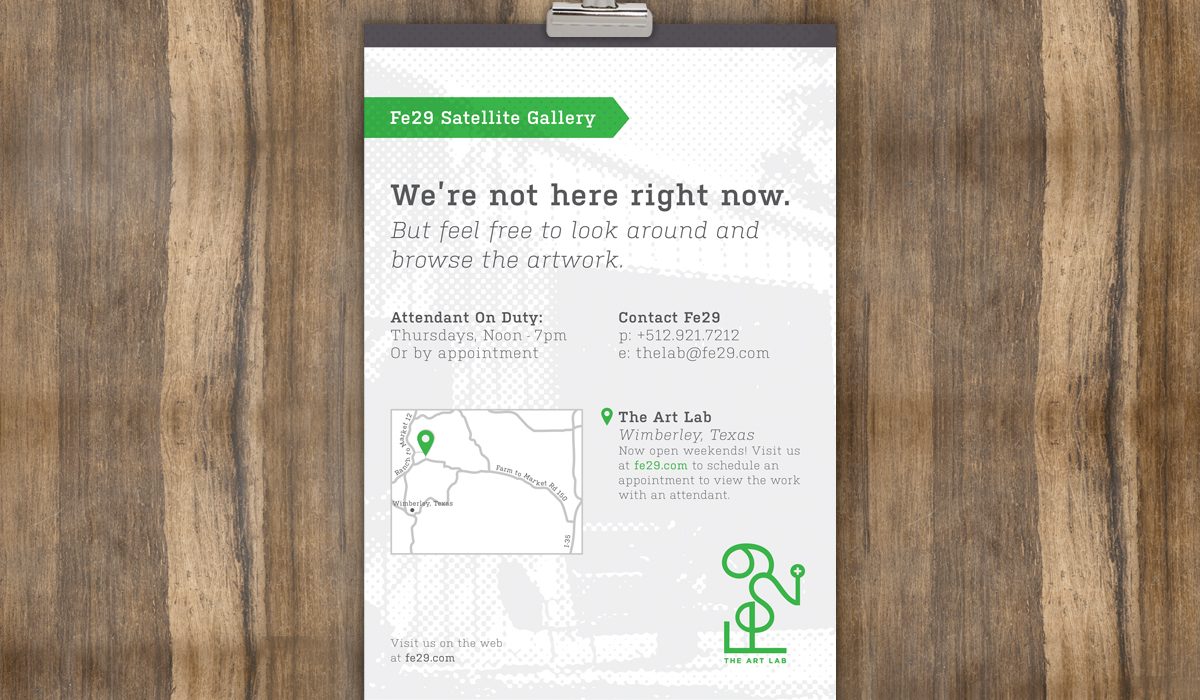
Fe29 Satellite Gallery Sign
A client for a design firm I interned at asked for a sign to display when they did not have someone on duty. Provided with the design system, I created a workable size for the piece, built a way finding map, and organized...
Read More ›